
Big data is very known words these days. It’s a broad term for data sets so large or complex that traditional data processing applications are adequate.
The most important benefits of visualization is,
Allows us to visual access to the huge amount of data in an easily digestible visual.
Recently I was in a situation to train a large set of tagged ‘corpus’ for a retail domain. Building a corpus from scratch is not that very easy task unless if you didn’t find an easy way to expand the data set. In the journey of training a model or to get a better understanding of the data the data need to be visualized.
Sample corpus data set:
car_JJ seats_NNS ._.
croft_NN barrow_NN women_JJ 's_POS ._.
frozen_JJ dress_NN ._.
cold_JJ shoulder_NN ._.
vera_NN ._.
beard_JJ trimmer_NN ._.
paper_JJ towel_JJ holders_NNS ._.
sonoma_JJ cargo_JJ pants_NNS ._.
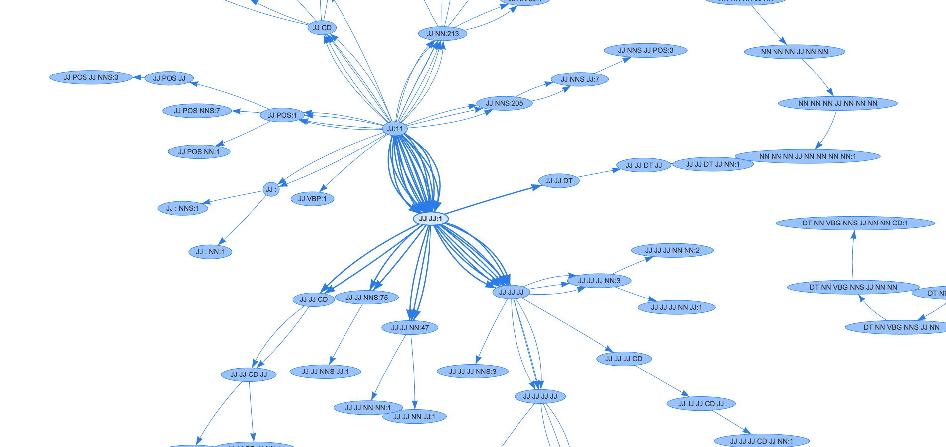
kettlebell_NN ._.My objective was to map the features including with the tagged label/class name. Therefore, it will help us to clearly understand the list of features and the constraints of the features in respective to Information Entropy theory.
There are so many graphs and each of them answers different questions. I chose network graph to represent the data collection because it’s the suitable graph for this situation.
The first challenging task is to process the list of corpus to a graph format data. Since my objective was to find the frequency of the features and to show the corresponding tags for the feature we can easily implement MapReduce Job. To implement it fast, I used Python MapReduce. I will create a separate blog to explain to implement Python MapReduce with the help of Hadoop Streaming. For the moment I’ll share the Mapper and Reducer code.
To execute hadoop job in terminal type the following command:
cat sample-corpus.txt| python featureFrequency/mapper.py tag-pattern | sort -k1,1 | python featureFrequency/reducer.py | tee results.txtProcessed corpus data set:
DT NN .	1
DT NN VBG NNS JJ NN NN CD .	1
FW .	1
IN .	8
JJ .	11
JJ : NN .	1
JJ : NNS .	1
JJ CC JJ NNS .	1
JJ CD IN JJ JJ JJ JJ JJ JJ NN .	1
JJ CD JJ JJ NN NN .	1
JJ CD JJ NN .	1
JJ CD NN .	1
After evaluating few graph libs I picked ‘vis.js’. vis.js library’s network graph is very easy to visualize and it’s customizable (Figure 1).
I hope you all got an idea of the process to visualize the data. I have taken POS Tag data to explain the flow and it can be changed to any data collections.